Monday, 11 April 2011
Saturday, 9 April 2011
Thursday, 7 April 2011


Star Image
For my Star Image icon, I chose to do Kurt Cobain. He was a leading icon within he rock genre and will forever be a legend. For me he was a natural choice as I have always been a fan of the work he did.
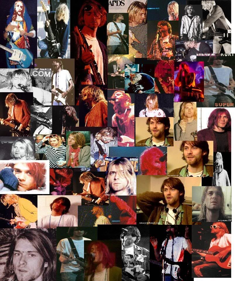
I would describe Kurt as iconic, revolutionary, intelligent, artistic, he was a typical rock-star and set the trend for other artists around the world and thousands of teenagers in his generation.
Lyp Syncing Exercise
It goes without saying, that if the lyp syncing in the video is off, the professional look we are trying to achieve will be instantly compramised. Unfortunately on the day of this excercise I was in the hospital having blood tests :( But Jamie and Faye the other 2 members of my group took part in a lyp sycning exercise.
The main trick was to edit the video to get the music in perfect time with the lip movements, thankfully my group showed me how to use the program and I now have the skills to do what is done in the video below.
Please enjoy my groups Lyp Syncing exercise!
The main trick was to edit the video to get the music in perfect time with the lip movements, thankfully my group showed me how to use the program and I now have the skills to do what is done in the video below.
Please enjoy my groups Lyp Syncing exercise!
Rock Genre Mind Map.
The gothic scene is a popular rock sub-genre, so as a group in order to help us all come the same conclusions of what we think about when someone says 'rock' we created a mind map. Using this mind map we all understand the codes of conventions of what we are trying to achieve a lot better.
 The subheadings cover almost everything we will need to stick to in order to complete our project.

Conventions of music video within the Gothic genre-
As we have chosen what can be classified as a gothic band to use in our music video, when filming there are several codes and conventions we have to apply to make sure we suit the genre. How would the band members dress? What would the narrative contain? What lighting would be used? I'll go into detail on each of these points below.
Costume-
Common colour schemes within the gothic genre include Black/ White with taints of red. I've applied this in creation of my album artwork, but in order to maintain this during the music video, everyone involved will need to be wearing dark articles of clothing. The song itself is called 'Bring Me To Life', so I could talk to my group and possibly incorporate the rare use of one bright colour amongst the gothic colour scheme to be associated with life. Below is an image of the band Evanescence, their costume is dark and excentric, something I should do my best to immitate when setting up costume for band images/ music video.
Narrative Content-
In order to stick by the gothic conventions, the narrative must be something dark and maybe in some ways even disturbing. The original music video for bring me to life - LINK HERE - involves the lead singer climbing out of her bedroom window following the sound of music, whilst singing the words to the song. Here they actually involve the performance side of the video with the narrative, perhaps something me and my group could consider doing?
If not, the narrative could include the lead singer enduring some kind of emotional burden and how she deals with it. No doubt this is something me and the group will sit down and discuss.
If not, the narrative could include the lead singer enduring some kind of emotional burden and how she deals with it. No doubt this is something me and the group will sit down and discuss.
Lighting-
Earlier I spoke about colour scheme and dresscode, whilst I could go for an entirely black and white video, in the modern day music video world this is eomthing you don't see often and I don't plan on bringing back. So the lighting must remain dark and eerie. As the weather is unfortunately impossible to control, using effects such as colour correction and brightness adjustment on the clips we film. Playing with the saturation will also allow us to bring out the darker colours and give the lighter colours a 'creepy' effect, giving the video exactly what kind of look we like.
However it is important to make sure the brightness settings we use in each clip are consistent or the video will look unproffessional.
Band Marketting - How can I use it?
Advertising in the modern day and age can be seen almost everywhere you look. We are constantly bombarded with brand names, slogans and catchy jingles, but there is a huge difference between effective advertising techniques and ones that wash over you on a daily basis.
In order to make my band a success, I should look into ways in which other successful artists have done so.
Enter Shikari-
This post-hardcore band from the UK use various promotion methods, some stem from it's record company while other methods they have sought out and maintained themselves. Their label has established a website for them, which fans can use to track the band, seek out tickets and discuss their latest releases.
The label also arrange live events for the band, besides actual shows they regularly take part in touring and cover signing for fans. It's also a common occurance that an interview with the band will be uploaded to YouTube for their fans to see.
On a personal level, the band runs a MySpace page and a facebook news feed page. This is something I could set up for the band I'm promoting, they will be able to maintain it themselves with ease and as the page grows their songs and events will be on a larger scale, and it's all for free!
Record Labels will also often line-up Magazine interviews and even covers for one of their bands. Below is a perfect example, KERRANG! is a rock magazine and features a large image of the band Enter Shikari. A large picture of the band on such a popularly read magazine will have no doubt worked wonders as far as promotion goes.
Wednesday, 6 April 2011
Album cut2

Since I made my first draft for this cover, I have re-evaluated the colour scheme and gone with a strict black and white idea. I have incorporated a bar behind the text that is 65% transparent so it does not interrupt the fractal background but still emphasizes the band name and the single title.
I decided to change the red brushes to white as I simply prefer the way it looks. I used a calligraphic font for the single name, as the song title is poetic and the lyrics too, the writing is artistic and reflects this well.
I also created a logo for ELJAF productions and placed it in the bottom left of the cover. This is conventional of modern day album art advertising and I thought it fitting to help promote the company. Should the company be considered reputable, this would also help promote the band.
I believe the background holds strong meaning concerning the gothic genre, it's dark mysterious complexity is intriguing and artistic, but at the same time is incredibly vacant, reflecting the attitudes of the gothic world.
As the song is called bring me to life and this is a single album cover, I intend to include some for of red center- piece. I am considering using a rose or a wishing well. I have also started work on the back cover and will post drafts shortly.
Album Cover Base

This is the initial background design for my album cover. I have also included the final font choice for the artist name. I created the background using a series of 'Fractal Brushes' that can be found on deviantart, the font is called Clarisse~ and I found it on dafont.com under the gotic fonts section.
In order to enhance the look of the brushes, I have given them a red tint and sharpened the dark blue background. The font has been given a nicer look by using the blending option: 'Outer Glow'. It makes it stand out from the background and helps raise the quality.
To finish my cover: I need to add the single name, finish the design, maybe add further images into the void in the background. Add any branding I need, like the label name. Maybe using a border and possibly reconsidering the colour scheme.
Friday, 1 April 2011
Underoath- Define the great line Artwork

This album is a little more similar to what I would like to achieve with my design. It has a deep meaning about crossing your inner boundries and the album titles message is conveyed with the huge split in scenery and in the individual.
The reason I chose to analyse this cover was because the gothic rock genre often attempts to do the same thing this one is doing, it has a base layer which makes it intreaguing to the eye and also a deeper meaning that once you listen to the music, you will understand.
The font used for the bands name on this cover is very formal and sharp. Block caps has been used and this matches the seriousness of the cover. However, a foreign letter has been used, although it is still pronounced as an 'O', the scandanavian letter 'Ø' can be seen in their logo. However for people in the UK, USA or fans of the band that don't know this foreign language, it has been branded 'The Underoath O'. Such a simple use of branding has triggered someone to remember aspects of the band, so while it's deeper meaning may be unknown to me at least, the clever marketing strategy behind it is very clear and very clever.
The gothic genre colour scheme is also maintained in this cover, the dark blacks and faded whites give a creepy look that will appeal to followers of the genre.
Subscribe to:
Comments (Atom)