Album art is a unique chance for musicians to express their artistic abilities and beliefs further. Album art in the past has been: iconic, revolutionary, controversial and is used as a main selling point on the shop stand. In theory, a consumer is far more likely to pick up a CD case if they are attracted to the front cover. So it needs to be eye catching. Some artists like to send a message in the art, but most use it to convey how they view themselves as artists.
From an album cover, you should be able to identify several things about the artist. What genre they are, what sub-genre if they have one. What kind of attitudes the artist holds, what time-period and target audience do they fall under?
Using a series of codes and conventions associated with my artist, I will create an album cover that is eye catching and represents my artist and their genre to a professional extent.
For instance the genre I am currently looking into is Rock/ Gothic. Conventions of this would be dark colours, with occasional red streaks. I could either include an image of the band, or a popular image seen within the gothic world, like a rose, skull or spider web.
I should remember to include the Artist name/ Logo on the front, back and spine. I should remember to incorporate the single name on the front and include pricing/ track listing on the back. I should also create some kind of logo for the music company that will be representing my artist (ELJAF Productions).
Monday, 24 January 2011
Font Choice - Album Cover
Now that I know I am working with the Rock/ Alternative genre, I need to choose which font I want to associate with my band. Using a font search engine I have selected 5 fonts that I think represent this genre well.
The fonts below are entitled:
1. Evanescent
2. Fairydust
3. Diablo
4. Akvaleir
5. Clarisse~

Although the first font represents the genre extremely well, is eye catching and memorable, it is currently associated with another popular band, so using it could backfire and remind my target audience of a band other than the one I am representing.
The second font is very gothic and represents the genre I am aiming for incredibly well. It is also very eye catching and I will consider using this font in my final piece.
I have ruled out font number 3 as I feel it is too difficult to read to be used commercially. If a member of my target audience cannot read the font instantly, they may move on before considering it, especially on shop shelf.
I have also decided against font 4 as I believe it is too plain to represent my artist. I require a font that is extremely eye catching so it will stand out from any competition on a shop shelf. I do not think this font will achieve this.
I have decided to consider font 5 for my final product as it is eye catching, bold, gothic and holds aspects of the emo/ alternative genre that are perfect for the artist me and my group discussed.
Album Artwork Introduction and Aims
When designing an album cover I need to keep a number of things in mind. When this album hits the shop shelves, it needs to be able to catch the eyes of customers and represent the band/ genre perfectly to make a sale. The cover must look appealing and professional, failure to take those aspects seriously will result in my album cover and therefore artist not being taken seriously.
Plan of Production
Before creating my finished product, I plan to make several drafts. The first will be hand drawn and then I will create the cover on Photoshop. I will then take what I learnt from making that cover to hand draw a design and create a final, finished cover that will represent my artist.
Research
I will need to conduct some deep research into the target audience and the genre of my artist before even thinking about a design. I need to discover what fonts, colours, images, layouts, band names etc. will work absolutely perfectly with what I'm trying to achieve.
I should also bare in mind that this cover should represent the music video I am going to help create with my production group. So does my cover hit the codes and conventions of the chosen genre in the same way as the music video?
Genre Selection
After speaking with my production team about which genre we would all feel comfortable working with, we came to the conclusion of Rock/ Alternative as it is something we all have in common. We also spent some time developing a Band Name and ended with 'Forgetting Last Friday'.
For more detail on the decisions above, click this link to go to the group blog.
As I am producing the bands Album Cover individually, I will need to decide on a design, font choice, album name and colour scheme.
For more detail on the decisions above, click this link to go to the group blog.
As I am producing the bands Album Cover individually, I will need to decide on a design, font choice, album name and colour scheme.
Wednesday, 24 November 2010
Nirvana- Nevermind (Updated)
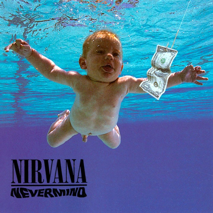
The cover above was released by the band Nirvana in 1991. The cover represents a corrupt American attitude concerning consumerism by showing a baby chasing a dollar bill on a fishing hook through water. Such anti-governmental beliefs are conventional of the rock genre, but are rarely expressed in album art this explicitly. The child being naked represents how as soon as an individual is born, they are forced into a society that is obsessed with material possessions.
The image itself is incredibly striking, the deep sea blue is extremely eye catching and the statement it comes with are incredibly controversial making the album stand out on any shelf. The deep blue of the sea is code for purity, showing an untouched background, as does the baby. Someone born fresh into this world without beliefs or knowledge is pure, so when the image shows the baby instantly chasing after material possessions, it sends a very striking, clear message.
The font choice is also very well done, the text is bold and well crafted, the capital letters and elegant designs are code for importance and insist that the band be taken seriously. The NEVERMIND font has been done in a water style to suit the rest of the cover, so the design is consistent.
Considering this cover, I should bare in mind whether or not when I am creating my cover, if I want to make something controversial as well as eye catching.
Thursday, 18 November 2010
Oasis Artwork - Be Here Now

The first thing we notice about the cover is the scattered materialistic items throughout the scene. The expensive car has been drivcn into the swimming pool, one of the band members can be seen looking upon a globe from a foot away with a telescope, showing us their disregard for the wealth they have aquired. The grammaphone has been placed in the foreground as a link back to their musical heritage, showing the audience that they remember what's important to them. But the general scene represents the band well, it's very rock star/ rebellious. They don't fear consequence and show a complete disregard for wealth, showing the audience that even though the bands stature has changed and they have become successful, they as individuals haven't changed a bit. We can tell this again from the possessions, the scooter and expensive car are of British origin. The band know where they came from.
Looking into symbolism, the globe represents world domination for the band, it was in their first album cover too, they use it to insist they have a high importance. The lead member of the band is once again in much clearer sight that the other members, this again is to show the heirachy of the band.
Tuesday, 16 November 2010
Subscribe to:
Posts (Atom)