Monday, 11 April 2011
Saturday, 9 April 2011
Thursday, 7 April 2011


Star Image
For my Star Image icon, I chose to do Kurt Cobain. He was a leading icon within he rock genre and will forever be a legend. For me he was a natural choice as I have always been a fan of the work he did.
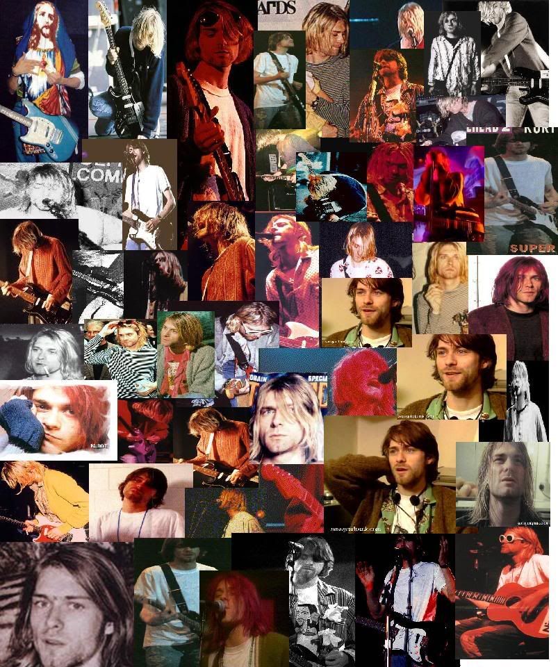
I would describe Kurt as iconic, revolutionary, intelligent, artistic, he was a typical rock-star and set the trend for other artists around the world and thousands of teenagers in his generation.
Lyp Syncing Exercise
It goes without saying, that if the lyp syncing in the video is off, the professional look we are trying to achieve will be instantly compramised. Unfortunately on the day of this excercise I was in the hospital having blood tests :( But Jamie and Faye the other 2 members of my group took part in a lyp sycning exercise.
The main trick was to edit the video to get the music in perfect time with the lip movements, thankfully my group showed me how to use the program and I now have the skills to do what is done in the video below.
Please enjoy my groups Lyp Syncing exercise!
The main trick was to edit the video to get the music in perfect time with the lip movements, thankfully my group showed me how to use the program and I now have the skills to do what is done in the video below.
Please enjoy my groups Lyp Syncing exercise!
Rock Genre Mind Map.
The gothic scene is a popular rock sub-genre, so as a group in order to help us all come the same conclusions of what we think about when someone says 'rock' we created a mind map. Using this mind map we all understand the codes of conventions of what we are trying to achieve a lot better.
 The subheadings cover almost everything we will need to stick to in order to complete our project.

Conventions of music video within the Gothic genre-
As we have chosen what can be classified as a gothic band to use in our music video, when filming there are several codes and conventions we have to apply to make sure we suit the genre. How would the band members dress? What would the narrative contain? What lighting would be used? I'll go into detail on each of these points below.
Costume-
Common colour schemes within the gothic genre include Black/ White with taints of red. I've applied this in creation of my album artwork, but in order to maintain this during the music video, everyone involved will need to be wearing dark articles of clothing. The song itself is called 'Bring Me To Life', so I could talk to my group and possibly incorporate the rare use of one bright colour amongst the gothic colour scheme to be associated with life. Below is an image of the band Evanescence, their costume is dark and excentric, something I should do my best to immitate when setting up costume for band images/ music video.
Narrative Content-
In order to stick by the gothic conventions, the narrative must be something dark and maybe in some ways even disturbing. The original music video for bring me to life - LINK HERE - involves the lead singer climbing out of her bedroom window following the sound of music, whilst singing the words to the song. Here they actually involve the performance side of the video with the narrative, perhaps something me and my group could consider doing?
If not, the narrative could include the lead singer enduring some kind of emotional burden and how she deals with it. No doubt this is something me and the group will sit down and discuss.
If not, the narrative could include the lead singer enduring some kind of emotional burden and how she deals with it. No doubt this is something me and the group will sit down and discuss.
Lighting-
Earlier I spoke about colour scheme and dresscode, whilst I could go for an entirely black and white video, in the modern day music video world this is eomthing you don't see often and I don't plan on bringing back. So the lighting must remain dark and eerie. As the weather is unfortunately impossible to control, using effects such as colour correction and brightness adjustment on the clips we film. Playing with the saturation will also allow us to bring out the darker colours and give the lighter colours a 'creepy' effect, giving the video exactly what kind of look we like.
However it is important to make sure the brightness settings we use in each clip are consistent or the video will look unproffessional.
Band Marketting - How can I use it?
Advertising in the modern day and age can be seen almost everywhere you look. We are constantly bombarded with brand names, slogans and catchy jingles, but there is a huge difference between effective advertising techniques and ones that wash over you on a daily basis.
In order to make my band a success, I should look into ways in which other successful artists have done so.
Enter Shikari-
This post-hardcore band from the UK use various promotion methods, some stem from it's record company while other methods they have sought out and maintained themselves. Their label has established a website for them, which fans can use to track the band, seek out tickets and discuss their latest releases.
The label also arrange live events for the band, besides actual shows they regularly take part in touring and cover signing for fans. It's also a common occurance that an interview with the band will be uploaded to YouTube for their fans to see.
On a personal level, the band runs a MySpace page and a facebook news feed page. This is something I could set up for the band I'm promoting, they will be able to maintain it themselves with ease and as the page grows their songs and events will be on a larger scale, and it's all for free!
Record Labels will also often line-up Magazine interviews and even covers for one of their bands. Below is a perfect example, KERRANG! is a rock magazine and features a large image of the band Enter Shikari. A large picture of the band on such a popularly read magazine will have no doubt worked wonders as far as promotion goes.
Wednesday, 6 April 2011
Album cut2

Since I made my first draft for this cover, I have re-evaluated the colour scheme and gone with a strict black and white idea. I have incorporated a bar behind the text that is 65% transparent so it does not interrupt the fractal background but still emphasizes the band name and the single title.
I decided to change the red brushes to white as I simply prefer the way it looks. I used a calligraphic font for the single name, as the song title is poetic and the lyrics too, the writing is artistic and reflects this well.
I also created a logo for ELJAF productions and placed it in the bottom left of the cover. This is conventional of modern day album art advertising and I thought it fitting to help promote the company. Should the company be considered reputable, this would also help promote the band.
I believe the background holds strong meaning concerning the gothic genre, it's dark mysterious complexity is intriguing and artistic, but at the same time is incredibly vacant, reflecting the attitudes of the gothic world.
As the song is called bring me to life and this is a single album cover, I intend to include some for of red center- piece. I am considering using a rose or a wishing well. I have also started work on the back cover and will post drafts shortly.
Album Cover Base

This is the initial background design for my album cover. I have also included the final font choice for the artist name. I created the background using a series of 'Fractal Brushes' that can be found on deviantart, the font is called Clarisse~ and I found it on dafont.com under the gotic fonts section.
In order to enhance the look of the brushes, I have given them a red tint and sharpened the dark blue background. The font has been given a nicer look by using the blending option: 'Outer Glow'. It makes it stand out from the background and helps raise the quality.
To finish my cover: I need to add the single name, finish the design, maybe add further images into the void in the background. Add any branding I need, like the label name. Maybe using a border and possibly reconsidering the colour scheme.
Friday, 1 April 2011
Underoath- Define the great line Artwork

This album is a little more similar to what I would like to achieve with my design. It has a deep meaning about crossing your inner boundries and the album titles message is conveyed with the huge split in scenery and in the individual.
The reason I chose to analyse this cover was because the gothic rock genre often attempts to do the same thing this one is doing, it has a base layer which makes it intreaguing to the eye and also a deeper meaning that once you listen to the music, you will understand.
The font used for the bands name on this cover is very formal and sharp. Block caps has been used and this matches the seriousness of the cover. However, a foreign letter has been used, although it is still pronounced as an 'O', the scandanavian letter 'Ø' can be seen in their logo. However for people in the UK, USA or fans of the band that don't know this foreign language, it has been branded 'The Underoath O'. Such a simple use of branding has triggered someone to remember aspects of the band, so while it's deeper meaning may be unknown to me at least, the clever marketing strategy behind it is very clear and very clever.
The gothic genre colour scheme is also maintained in this cover, the dark blacks and faded whites give a creepy look that will appeal to followers of the genre.
Thursday, 3 February 2011
Music Video Analysis x4
White Stripes, Seven Nation Army.
Popular band who's video despite its simplicity, caught the attention of thousands. Due to it's success, it's simplicity and the fact that I like this song... I have chosen to analyse this video.
The first noticeable thing we see in this video is it's effective and consistent editing to the beat. The drumming rhythm is very powerful. This suggests that the artist wants us to focus on the music as its main feature. This is supported further as we are constantly shown the instruments and the artists over and over again, from different angles, in different colours and even at different sizes.
A consistent colour scheme is used throughout. Black, white and red, the same colour scheme I plan to use in my artwork and a conventional colour scheme on the darker side of the rock and roll world, especially the gothic side.
The editing is very clever, the triangles coming forward change pace to match the music, speeding up and slowing down at the exact right times. This is something we must be sure to incorporate in our video.
Ghetto Gospel, 2Pac.
I have chosen to also do this video as it focuses 100% on narrative, a complete contrast to the white stripes who have effectively no narrative.
The meaning of the lyrics to this song are constantly shown through both the narrative and imagery. The narrative shows a young man growing up trapped in a rough neighbourhood with a religous mother. He seeks to escape the pressures of his peers but in the end of the narrative is killed in a drive by, a tragic ending to a sad song.
Religous imagery is used throughout the entire video. The church in the neighbourhood in focused on during several scenes and statues of Jesus/ the crucifix are often seen in the background. The lighting around the individual also suggests he is of importance or in a deeper sense~ being watched over by god.
The lyrics often match what we are seeing in the video. "Lord can you hear me speak?" is heard alongside an image of Jesus Christ. This kind of editing is something I could realistically incorporate into my video.
Green Day, When September Ends.
This video unlike the two above has a good mix of both narrative and performance.
The performance shots of the band show them elevated on platforms, this gives them a sense of importance or 'stature'. Their costumes are conventional of the Punk Genre this band is associated with, the thin ties, skinny jeans and slick excentric hair styles with the eye make-up are classic punk.
The narrative storyline involves the love life of two teenagers, one of which goes off to war leaving the other behind. The narrative at one stage inerupts the music, the song stops and an argument between the couple breaks out. This makes the audience equally focus on both the narrative and the song itself, especially how the cleverly compliment each other.
Emotion in the characters is conveyed perfectly with the use of varied shots, close-ups especially let us see the pain the girl goes through when her boyfriend goes out to war. Different camera shots were something we as a group had thougt about doing right from the start, but using them effectively in the narrative to convey emotion is something we hadn't thought about before watching this video.
Michael Jackson, Thriller.
This video was groundbreaking. It shook the world with it's extremely high budget listings, amazing dancing and revolutionary narrative style. Something as iconic as this, couldn't be overlooked.
Horror! Werewolves, dark lighting, the undead all very gothic so applying some of the things I've seen in this video to mine would be perfect!
To start off, no expense has been spared with costume, and while I don't plan to be quite as out there as Michael Jackson, applying to right costume to the right character is essential! The red and black suit MJ is sporting is conventional of the horror genre and goes fantasically with his character both in his regular form and when he's a member of the undead.
You can pause this video at any moment throughout it's 11 minute endurment and anaylse the Mise en scene and it always represents its genre and purpose perfectly! This leads me to think about what I should do with the background in my video, where should I film it? What time of day? Everything seen in my shots must suit what I am trying to achieve just like it has been done in Thriller.
The narrative of this video is unline any other I've ever seen. The music goes from being non-diagetic to a part of the actual story! Yet the narrative manages to not draw us away from the fact we are watching a music video!
The beauty of immersing the film Thriller into an 11 minutes masterpiece music video informs me of why this video was such a success. It has been imitated countless times and for good reason! If I could take away from this video the importance of mise en scene, costume and genre consistency, my video will surely have the professional look to it.
Wednesday, 2 February 2011
Music video analysis - Lost Prophets
I have chosen to refer to this music video as in terms of narrative, it is very similar to what we as a group would like to achieve. The narrative follows several teenagers who are enduring some kind of emotional trial. Whether it be with parents at school at work, but this is something we definitely want to incorporate.
Besides the narrative, this video is jam packed full of conventions we can use in our video. The opening of the video features several blurs and 'fade-ins' which makes us very aware that we are watching a music video. The first thing I noticed about it was the editing, there are rapid transitions between the band performing the actual song on the skyscraper. The swift edits fit in very well with the song and in a lot of places we actually see some of the editing is done on the beat.
The most important thing about the narritive in this video is the climax at the end. The main actors lash out in aggression by releasing an almighty scream, fitting with the lyrics of the video "Scream your heart out!". When they do this we see reality completely vanish as plates fly, windows smash and rooms get trashed. This symbolises the extreme pressure the characters have been put under and the song and screaming helps them effectively let it all out.
Bending reality in music videos is something we see, not all the time but enough for it to be normal to us. In the lost prophets video we are not shocked to see the destruction stemming from the teenagers screams, so we should note this for when we create our own video.
Tuesday, 1 February 2011
This band 'Lacuna Coil' is from the same genre as Evanescence and I'm watching this video to learn about dress code. This particular music video doesn't have a main narrative and focuses on the band performing the song. The video holds a number of Alternative/ Gothic conventions, starting with the red curtain and out of focus shot of the band, moving onto a shot of the female lead singer. Already in the first 12 seconds, the colour scheme of black and red (convention of Gothic) have been established. The dress the female vocalist is wearing is a dark black, as is her hair and her skin is extremely pale, classic costume of the gothic convention, a lot like what you would find in an Evanescence video.
The men in the band are dressed in suits with skinny ties, their shirts are untucked and their hair styles are long. This represents a clash between formality and individuality, something often seen in the Alternative music world.
The setting of the video represents the meaning of the song and as it doesn't relate to what I am trying to achieve with the video I will create, so I'll ignore that and take from this video the following things-
Dress code should represent the gothic sub-genre, Red/ Black and occasional white.
Hair Styles for men should be long or extraordinarily styled.
Hair Styles for females should be dark.
A Punk like dress code associated with Alternative (scruffy suits) could be incorporated.
Monday, 24 January 2011
The use of Album Artwork
Album art is a unique chance for musicians to express their artistic abilities and beliefs further. Album art in the past has been: iconic, revolutionary, controversial and is used as a main selling point on the shop stand. In theory, a consumer is far more likely to pick up a CD case if they are attracted to the front cover. So it needs to be eye catching. Some artists like to send a message in the art, but most use it to convey how they view themselves as artists.
From an album cover, you should be able to identify several things about the artist. What genre they are, what sub-genre if they have one. What kind of attitudes the artist holds, what time-period and target audience do they fall under?
Using a series of codes and conventions associated with my artist, I will create an album cover that is eye catching and represents my artist and their genre to a professional extent.
For instance the genre I am currently looking into is Rock/ Gothic. Conventions of this would be dark colours, with occasional red streaks. I could either include an image of the band, or a popular image seen within the gothic world, like a rose, skull or spider web.
I should remember to include the Artist name/ Logo on the front, back and spine. I should remember to incorporate the single name on the front and include pricing/ track listing on the back. I should also create some kind of logo for the music company that will be representing my artist (ELJAF Productions).
Font Choice - Album Cover
Now that I know I am working with the Rock/ Alternative genre, I need to choose which font I want to associate with my band. Using a font search engine I have selected 5 fonts that I think represent this genre well.
The fonts below are entitled:
1. Evanescent
2. Fairydust
3. Diablo
4. Akvaleir
5. Clarisse~

Although the first font represents the genre extremely well, is eye catching and memorable, it is currently associated with another popular band, so using it could backfire and remind my target audience of a band other than the one I am representing.
The second font is very gothic and represents the genre I am aiming for incredibly well. It is also very eye catching and I will consider using this font in my final piece.
I have ruled out font number 3 as I feel it is too difficult to read to be used commercially. If a member of my target audience cannot read the font instantly, they may move on before considering it, especially on shop shelf.
I have also decided against font 4 as I believe it is too plain to represent my artist. I require a font that is extremely eye catching so it will stand out from any competition on a shop shelf. I do not think this font will achieve this.
I have decided to consider font 5 for my final product as it is eye catching, bold, gothic and holds aspects of the emo/ alternative genre that are perfect for the artist me and my group discussed.
Album Artwork Introduction and Aims
When designing an album cover I need to keep a number of things in mind. When this album hits the shop shelves, it needs to be able to catch the eyes of customers and represent the band/ genre perfectly to make a sale. The cover must look appealing and professional, failure to take those aspects seriously will result in my album cover and therefore artist not being taken seriously.
Plan of Production
Before creating my finished product, I plan to make several drafts. The first will be hand drawn and then I will create the cover on Photoshop. I will then take what I learnt from making that cover to hand draw a design and create a final, finished cover that will represent my artist.
Research
I will need to conduct some deep research into the target audience and the genre of my artist before even thinking about a design. I need to discover what fonts, colours, images, layouts, band names etc. will work absolutely perfectly with what I'm trying to achieve.
I should also bare in mind that this cover should represent the music video I am going to help create with my production group. So does my cover hit the codes and conventions of the chosen genre in the same way as the music video?
Genre Selection
After speaking with my production team about which genre we would all feel comfortable working with, we came to the conclusion of Rock/ Alternative as it is something we all have in common. We also spent some time developing a Band Name and ended with 'Forgetting Last Friday'.
For more detail on the decisions above, click this link to go to the group blog.
As I am producing the bands Album Cover individually, I will need to decide on a design, font choice, album name and colour scheme.
For more detail on the decisions above, click this link to go to the group blog.
As I am producing the bands Album Cover individually, I will need to decide on a design, font choice, album name and colour scheme.
Subscribe to:
Comments (Atom)